Bayesian regression of heart data
This post tries to use Bayesian linear regression to explore causes of heart disease.
Bayesian linear regression
library("corrplot")
library(ncvreg)
library(ipred)
library(dplyr)
library(ggplot2)
library(RColorBrewer)
#data(dystrophy)
data(heart)
dim(heart)
## [1] 462 10str(heart)## 'data.frame': 462 obs. of 10 variables:
## $ sbp : int 160 144 118 170 134 132 142 114 114 132 ...
## $ tobacco : num 12 0.01 0.08 7.5 13.6 6.2 4.05 4.08 0 0 ...
## $ ldl : num 5.73 4.41 3.48 6.41 3.5 6.47 3.38 4.59 3.83 5.8 ...
## $ adiposity: num 23.1 28.6 32.3 38 27.8 ...
## $ famhist : num 1 0 1 1 1 1 0 1 1 1 ...
## $ typea : int 49 55 52 51 60 62 59 62 49 69 ...
## $ obesity : num 25.3 28.9 29.1 32 26 ...
## $ alcohol : num 97.2 2.06 3.81 24.26 57.34 ...
## $ age : int 52 63 46 58 49 45 38 58 29 53 ...
## $ chd : int 1 1 0 1 1 0 0 1 0 1 ...##Omit NA’s and plot variables to see if there’s correlations
dat = heart
Cor <- cor(dat)
corrplot(Cor, type="upper", method="ellipse", tl.pos="d")
corrplot(Cor, type="lower", method="number", col="black",
         add=TRUE, diag=FALSE, tl.pos="n", cl.pos="n")
dat %>%
    as.data.frame() %>%
    select(-c(famhist)) %>%
    melt() %>%
    ggplot(aes(x=value, fill=variable))+
        geom_histogram(colour="black", size=0.1) +
        facet_wrap(~variable, ncol=3, scale="free") +
        theme_classic() +
        scale_fill_brewer(palette="Set1")+
        theme(legend.position="none")
#Divide the data into training and test set
chdYes = heart[heart$chd==1,]
chdNo = heart[heart$chd==0,]

sampleYes = sample(rownames(chdYes), nrow(chdYes)*0.8)
sampleNo = sample(rownames(chdNo), nrow(chdNo)*0.8)

trainYes = chdYes[sampleYes,]
trainNo = chdNo[sampleNo,]

testYes = chdYes[!rownames(chdYes) %in% sampleYes,]
testNo = chdNo[!rownames(chdNo) %in% sampleNo,]

dat = rbind(trainYes, trainNo)
test = rbind(testYes, testNo)
###Model the data with JAGS As we have centered the data around 0, the distribution of Beta will follow a double exponential distriubtion.
X = scale(dat[,-10],  center=TRUE, scale=TRUE)

X %>%
    as.data.frame() %>%
    select(-c(famhist)) %>%
    melt() %>%
    ggplot(aes(x=value, fill=variable))+
        geom_histogram(colour="black", size=0.1) +
        facet_wrap(~variable, ncol=3, scale="free") +
        theme_classic() +
        scale_fill_brewer(palette="Set1")+
        theme(legend.position="none")
mod_glm = summary(glm(chd ~ ., data=dat))#JAGS model
library("rjags")
mod1_string = " model {
    for (i in 1:length(y)) {
        y[i] ~ dbern(p[i])
        #logit(p[i]) = int + b[1]*AGE[i] + b[2]*CK[i] + b[3]*H[i] + b[4]*PK[i] + b[5]*LD[i]
        logit(p[i]) = int + b[1]*sbp[i] + b[2]+tobacco[i] + b[3]*ldl[i] +
            b[4]*adiposity[i] + b[5]*famhist[i] +b[6]*typea[i] +b[7]*obesity[i] + b[8]*alcohol[i] + b[9]*age[i]
    }
    int ~ dnorm(0.0, 1.0/25.0)
    for (j in 1:9) {
        b[j] ~ ddexp(0.0, sqrt(2.0)) # has variance 1.0
        #b[j] ~ dnorm(0.0, 2) # noninformative for logistic regression
        #b[j] ~ dnorm(0.0, 1.0/4.0^2)
    }
} "


data_jags = list(y=dat[,10], sbp=X[,"sbp"], tobacco=X[,"tobacco"], ldl=X[,"ldl"],
        adiposity=X[,"adiposity"], famhist=X[,"famhist"],
        typea=X[,"typea"], obesity=X[,"obesity"], alcohol=X[,"alcohol"], age=X[,"age"])


params = c("int", "b")
##Run JAGS
## Error: <text>:3:1: unexpected ','
## 2: suppressMessages(update(mod1, 5e3))
## 3: ,
##    ^
convergence diagnostics
1) No pattern in traceplot 2) After 5e3 updates (e.g. burn ins I still observe autocorrelation in b[2] and in int) Increasing it to 5e4 3) DIC Mean deviance: 503.9 penalty 8.646 Penalized deviance: 512.5
plot(mod1_sim)


gelman.diag(mod1_sim)## Potential scale reduction factors:
##
## Point est. Upper C.I.
## b[1] 1.00 1.00
## b[2] 1.05 1.11
## b[3] 1.00 1.00
## b[4] 1.00 1.01
## b[5] 1.00 1.00
## b[6] 1.00 1.00
## b[7] 1.00 1.00
## b[8] 1.00 1.00
## b[9] 1.00 1.00
## int 1.04 1.10
##
## Multivariate psrf
##
## 1.02autocorr.diag(mod1_sim)## b[1] b[2] b[3] b[4] b[5]
## Lag 0 1.000000000 1.0000000 1.0000000000 1.000000000 1.0000000000
## Lag 1 0.287920926 0.9851922 0.3462278072 0.722909298 0.2658015636
## Lag 5 0.010262570 0.9378278 0.0008810413 0.205100190 0.0024193182
## Lag 10 0.007303032 0.8806068 0.0132742196 0.030675749 -0.0005156971
## Lag 50 0.005479209 0.5317571 -0.0033351594 0.005065785 -0.0052446834
## b[6] b[7] b[8] b[9] int
## Lag 0 1.000000000 1.000000000 1.000000000 1.000000000 1.0000000
## Lag 1 0.301678048 0.630132049 0.239460718 0.534791017 0.9852943
## Lag 5 0.004675731 0.172722918 -0.006375527 0.092841859 0.9369034
## Lag 10 0.004933605 0.036995541 -0.002855998 0.005109218 0.8799680
## Lag 50 -0.002915316 0.007974022 0.004067879 -0.006795221 0.5316811autocorr.plot(mod1_sim)


effectiveSize(mod1_sim)## b[1] b[2] b[3] b[4] b[5] b[6]
## 8172.85337 96.52570 6961.24000 2350.24891 8535.10192 7542.87353
## b[7] b[8] b[9] int
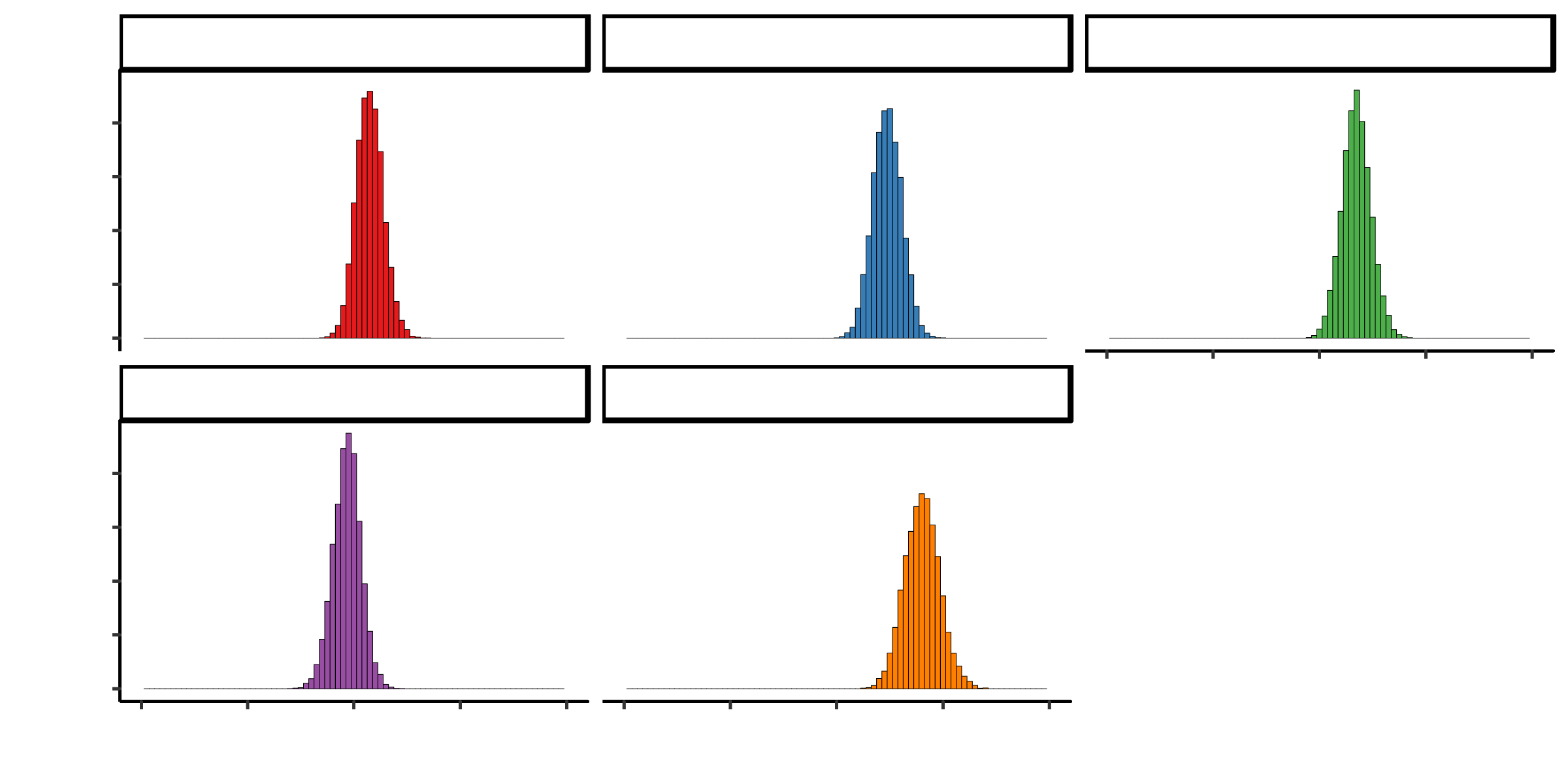
## 2810.94261 8762.84597 3950.24210 98.74925##Summary statistics I observe that tobacco, adiposity and alcohol have posterior probabilities centered around 0. This means that they do not contribute much to heart disease I remove these and compare between models
dic1## Mean deviance: 394.9
## penalty 8.171
## Penalized deviance: 403.1posterior <- mod1_csim[,1:9]
colnames(posterior) <- colnames(X)
posterior%>%
as.data.frame() %>%
select(-c(famhist)) %>%
melt() %>%
ggplot(aes(x=value, fill=variable))+
geom_histogram(colour="black", size=0.1, binwidth=0.05) +
facet_wrap(~variable, ncol=3) +
theme_classic() +
scale_fill_brewer(palette="Set1")+
theme(legend.position="none") +
xlim(-3, 3)
##Ajust model to remove terms centered around 0 Here the autocorrelation disappers and the effective smaple size is larger for all variables


Comparing the models
DIC for model 1 is larger than for model 2. Therefore, model2 is better and I will use this
dic1## Mean deviance: 394.9
## penalty 8.171
## Penalized deviance: 403.1dic2## Mean deviance: 388.3
## penalty 6.957
## Penalized deviance: 395.2dic1 - dic2## Difference: 7.843772
## Sample standard error: 26.6649summary(mod2_sim)##
## Iterations = 6001:11000
## Thinning interval = 1
## Number of chains = 3
## Sample size per chain = 5000
##
## 1. Empirical mean and standard deviation for each variable,
## plus standard error of the mean:
##
## Mean SD Naive SE Time-series SE
## b[1] 0.14946 0.1264 0.001032 0.001493
## b[2] 0.47494 0.1349 0.001101 0.001532
## b[3] 0.40884 0.1226 0.001001 0.001293
## b[4] 0.34692 0.1351 0.001103 0.001542
## b[5] -0.06677 0.1289 0.001052 0.001496
## b[6] 0.80272 0.1645 0.001343 0.002163
## int -0.87060 0.1362 0.001112 0.001631
##
## 2. Quantiles for each variable:
##
## 2.5% 25% 50% 75% 97.5%
## b[1] -0.08968 0.0631 0.1470 0.2336 0.4073
## b[2] 0.21582 0.3816 0.4739 0.5666 0.7386
## b[3] 0.16948 0.3266 0.4088 0.4910 0.6501
## b[4] 0.08586 0.2571 0.3455 0.4353 0.6193
## b[5] -0.32615 -0.1513 -0.0634 0.0181 0.1826
## b[6] 0.48890 0.6896 0.8020 0.9113 1.1381
## int -1.14168 -0.9611 -0.8686 -0.7798 -0.6092posterior <- mod2_csim[,1:6]
colnames(posterior) <- colnames(X)[-c(2,4,8)]
posterior%>%
as.data.frame() %>%
select(-c(famhist)) %>%
melt() %>%
ggplot(aes(x=value, fill=variable))+
geom_histogram(colour="black", size=0.1, binwidth=0.05) +
facet_wrap(~variable, ncol=3) +
theme_classic() +
scale_fill_brewer(palette="Set1")+
theme(legend.position="none") +
xlim(-2, 2)
``` #Predict Using our trained model we have a 0.72 accuracy
(pm_coef = colMeans(mod2_csim))## b[1] b[2] b[3] b[4] b[5] b[6]
## 0.14946415 0.47494319 0.40884479 0.34692490 -0.06676623 0.80272040
## int
## -0.87059519pm_Xb = pm_coef["int"] + X[,c(1, 3,5,6,7, 9)] %*% pm_coef[1:6]
phat = 1.0 / (1.0 + exp(-pm_Xb))
head(phat)## [,1]
## 217 0.3155766
## 353 0.7529948
## 413 0.8381924
## 20 0.6011533
## 4 0.7105916
## 335 0.5084351plot(phat, jitter(dat[,10]))
(tab0.5 = table(phat > 0.5, data_jags2$y))##
## 0 1
## FALSE 202 63
## TRUE 39 65sum(diag(tab0.5)) / sum(tab0.5)## [1] 0.7235772#0.72
X.test = scale(test[,-10], center=TRUE, scale=TRUE)
pm_Xb = pm_coef["int"] + X.test[,c(1, 3,5,6,7, 9)] %*% pm_coef[1:6]
phat = 1.0 / (1.0 + exp(-pm_Xb))
head(phat)## [,1]
## 8 0.6404793
## 19 0.8607690
## 30 0.6674311
## 31 0.1959541
## 36 0.1227429
## 54 0.1375159plot(phat, jitter(test[,10]))
(tab0.5 = table(phat > 0.5, test[,10]))##
## 0 1
## FALSE 49 16
## TRUE 12 16sum(diag(tab0.5)) / sum(tab0.5)## [1] 0.6989247#0.73