New york census data
Plotting New York city neighbourhoods
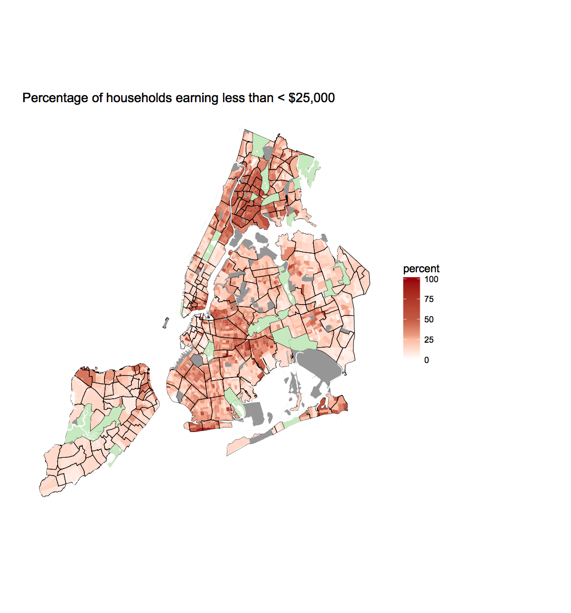
This blog plots the percentage of low-income housholds in each census are of NYC. Low-income households are defined as households with an income of less than $25,000
Inspiration form: http://zevross.com/blog/2015/10/14/
For census tables: https://censusreporter.org/topics/table-codes/
Loading libraries
library(tigris)
library(acs)
library(stringr)
library(dplyr)
library(ggmap)
library(maptools)
library(ggplot2)
library(maps)
library(RColorBrewer)
library(htmlwidgets)
library(rvg)
library(ggiraph)
library(gganimate)
library(gridExtra)
library(grid)
library(sp)
library(rgdal)
library(rgeos)
library(proj4)
library(data.table)
library(tidyverse)
library(broom)
Retrive census data and NYC map
Here we download all the census information for NYC regarding income
counties <- c(5, 47, 61, 81, 85)
tracts <- tracts(state = 'NY', county = c(5, 47, 61, 81, 85), cb=T)

#tract <- readOGR(dsn="2010 Census Blocks", layer = "geo_export_0d5391be-e106-4007-ba4b-8b9ca965d298")

api.key.install(key="e39e18eef6390892f0e0f1a1273b9ddd09cfbc7f")
# create a geographic set to grab tabular data (acs)
geo<-geo.make(state=c("NY"),
              county=c(5, 47, 61, 81, 85), tract="*")


income<-acs.fetch(endyear = 2012, span = 5, geography = geo,
                              table.number = "B19001", col.names = "pretty")


edu<-acs.fetch(endyear = 2012, span = 5, geography = geo,
table.number = "B15001", col.names = "pretty")

income_df <- data.frame(paste0(str_pad(income@geography$state, 2, "left", pad="0"),
                             str_pad(income@geography$county, 3, "left", pad="0"),
                             str_pad(income@geography$tract, 6, "left", pad="0")),
                        income@estimate[,c("Household Income: Total:",
                        "Household Income: $200,000 or more",
                        "Household Income: $20,000 to $24,999",
                        "Household Income: $15,000 to $19,999",
                        "Household Income: $10,000 to $14,999",
                        "Household Income: Less than $10,000")],
                        stringsAsFactors = FALSE)

rownames(income_df)<-1:nrow(income_df)
names(income_df)<-c("GEOID", "total",
                "over_200",
                'between20_24',
                'between15_20',
                'betwee10_14',
                'under10')
income_df$percent <- 100*((income_df$between20_24 +
                        income_df$between15_20 +
                        income_df$betwee10_14 +
                        income_df$under10)/income_df$total)


ggtract<-fortify(tracts, region = "GEOID")
ggtract$region <- ggtract$id
ggtract <- subset(ggtract, select=c(long, lat,region))
Get the water coordinates
For some reason the census tracks downloaded extends into the water. To remove this, I downloaded the water coordinates for all boroughs in NYC and plotted them.
NYC_water <- area_water("NY", "NEW YORK")
NYC_water <-tidy(NYC_water)
colnames(NYC_water)[1:3] <- c('long', 'lat', 'region')

bronkxWater <- area_water("NY", c("BRONX"))
bronkxWater <-tidy(bronkxWater)
colnames(bronkxWater)[1:3] <- c('long', 'lat', 'region')

quansWater <- area_water("NY", "QUEENS")
quansWater <-tidy(quansWater)
colnames(quansWater)[1:3] <- c('long', 'lat', 'region')

brookWater <- area_water("NY", "KINGS")
brookWater <-tidy(brookWater)
colnames(brookWater)[1:3] <- c('long', 'lat', 'region')

statWater <- area_water("NY", "RICHMOND")
statWater <-tidy(statWater)
colnames(statWater)[1:3] <- c('long', 'lat', 'region')
Get NYC neighborhoods (From https://rpubs.com/jhofman/nycmaps)
I also wanted to split the map into different NYC neighbourhoods to get a sense of how the split of low-income households are per neighbourhood
r <- GET(paste0('http://data.beta.nyc//dataset/0ff93d2d-90ba-457c-9f7e-39e47bf2ac5f/',
'resource/35dd04fb-81b3-479b-a074-a27a37888ce7/',
'download/d085e2f8d0b54d4590b1e7d1f35594c1pediacitiesnycneighborhoods.geojson'))
nyc_neighborhoods <- readOGR(content(r,'text'), 'OGRGeoJSON', verbose = F)

nyc_df <- tidy(nyc_neighborhoods)
nyc_df$region <- nyc_df$id
nyc_df <- subset(nyc_df, select=c(long, lat, region))
Annotate neighbourhoods
Make sure to separate the parks for the data
neighbourhood_names <- data.frame(nyc_neighborhoods)
neighbourhood_names$id <- rownames(neighbourhood_names)


nycParks <- neighbourhood_names[grep('Park', neighbourhood_names$neighborhood),]

nycParks <- nycParks[grep('Park Slope|Sunset Park|Borough Park|Park Hill|
            Parkchester|Morris Park|Rego Park|Floral Park',
            nycParks$neighborhood, invert=T),]
Add info for interactive plot
Interactive map is not used here.
income_df$tip <- paste0(
"<br>", paste0(round(income_df$percent,2),'%'))
Plot NYC
p <- ggplot(income_df, aes(map_id=GEOID)) +
 geom_map_interactive(data=income_df, map=ggtract,
         aes(map_id=GEOID, data_id=GEOID, tooltip=tip, fill=percent),colour=NA, size=0.05)+
 geom_map_interactive(data=neighbourhood_names, map=nyc_df,
         aes(map_id=id, data_id=id), colour='black', alpha=0, size=0.25)+
 geom_map_interactive(data=income_df[income_df$total<100,],
         map=ggtract, aes(map_id=GEOID, data_id=GEOID),fill='#969696', size=0.05)+
 geom_map_interactive(data=nycParks, map=nyc_df,
         aes(map_id=id, data_id=id),fill='#c7e9c0', size=0.05)+
 geom_map_interactive(data=NYC_water, map=NYC_water,
         aes(map_id=region, data_id=region), fill='white', colour='white', size=0.05)+
 geom_map_interactive(data=bronkxWater, map=bronkxWater,
         aes(map_id=region, data_id=region), fill='white', colour='white', size=0.05)+
 geom_map_interactive(data=quansWater, map=quansWater,
         aes(map_id=region, data_id=region), fill='white', colour='white', size=0.05)+
 geom_map_interactive(data=brookWater, map=brookWater,
         aes(map_id=region, data_id=region), fill='white', colour='white', size=0.05)+
 geom_map_interactive(data=statWater, map=statWater,
         aes(map_id=region, data_id=region), fill='white', colour='white', size=0.05)+
 expand_limits(x = nyc_df$long, y = nyc_df$lat)+
 theme_void()+
 theme(plot.background = element_rect(fill = 'white'))+
 scale_fill_gradientn(colours = c("#99000d", "#fcbba1", "white"),
                        values = c(1,0.5, .3, .2, .1, 0))+
# scale_fill_brewer(palette='Blues')+
 ggtitle('Percentage of households earning less than < $25,000')

 ggiraph(code = {print(p)},  hover_css = "fill:red;r:3pt;" ,height_svg=6)